


Is it better to emulate your ICP or follow trends?
Season 9, issue 11: To be (corporate) or not to be (obviously a startup)
📬In this issue:
What makes a website “corporate” vs “startup”?
Is it better to emulate the type of customer you’re going after, or embrace being a scrappy company?
Housekeeping and shout outs!
Hey Mehketeer,
Before we jump into this week’s issue, I wanna give a shout out to the mad lad that is Gaz Williams for his new content series RULELESS. The first issue, featuring an interview with Jess Wheeler, was a great read and I’m loving the long long read format of it.
For non-aussies, and more specifically people who didn’t grow up in western Sydney(?), mad lad is a compliment.
Onto the issue:
Impersonation is the sincerist form of flattery
This issue is inspired by an old client who had a meeting with a potential customer, and that customer said “your website doesn’t look very corporate.”
This particular client already had some impressive clients — large government departments, not-for-profits, and some enterprise organisations. Typically, we use social proof to signal what type of customers we’re able to service, and they already had logos, case studies, and testimonials all throughout the website and supporting marketing materials.
It really got me thinking. If you want to sell to enterprise, do you need to look enterprise yourself? And what does “looking enterprise” even mean?!
The classic tech or startup website is easy to spot a mile away. Most often, they’re using the latest (or recent) design trends, they’re colourful, and they have fairly standarised content modules. Despite their investment in speed and bells and whistles, they often won’t pass a web accessibility test.
Example websites: Equidi, Lorikeet, and Procore.


On the other hand, what constitutes “corporate” design?
It’s hard to say there’s one “corporate” design trend, because really what is corporate? If we’re going off the largest companies in the country, Bega is in the ASX 200 and yet their website is kind of startup-y in style! On the other hand, KPMG, Brookfield, and Goodman come across as pretty corporate. Somewhere in the middle is CCEP.
The commonalities between the corporate-corporate websites seem to be:
Full-width content, still nicely padded and with white space, but the whole screen is used instead of keeping a narrower, centralised column of content
CTAs are focused on directing you to other parts of the website, not really converting you or signing you up to an email list
Much more emphasis on the outputs of the org over the products and services, i.e. blogs, whitepapers, case studies, press releases, and news
The above the fold is far more brand-focused than the startup websites, which focus on positioning
Most of the navigation bars or menus have a mention of initiatives and governance, and speak to industries they serve first before mentioning what they do
Custom photography libraries and substantial investment in design elements (motion design, illustration, etc.) with no stock assets


CMS
Bega and Goodman are built on Wordpress. Brookfield seems to be a mish-mash of custom made, Drupal, and others. KPMG is using Adobe Experience Manager. CCEP looks custom made. On the tech side, Equidi is built on UNPKG, Lorikeet is also on UNPKG as well as Webflow, and Procore is on Contentful.
Design vs storytelling
Caroline Voaden on LinkedIn argued that corporate websites aren’t necessarily badly designed, but tend to have poor storytelling. I don’t disagree with this. I noticed a real lack of any mention of pain points, instead there’s a lot of lofty, future-focused positioning around changing the world, without saying what they actually do.
Fundamentally, they’re so large and work in such a bespoke way it would be really difficult to succinctly say what they do though.
Procore and Brookfield
So Brookfield is a customer of Procore, and Procore’s website is by far the most advanced out of the tech/startup category. They have their own custom imagery, have a full-width layout, but follow the more typical tech content and navigation.
Using the Way Back Machine, it seems like Procore has had a more corporate style since the beginning. Maybe this is a hangover from the fact that they’ve always had a core focus on the construction industry, and this is actually the style of construction websites.
Custom imagery is pretty easy to come by in construction because clients are taking photos of the site constantly. They did seem to switch back and forth between the full-width columns and the more SaaS-y central column style as below:

Who even am I 🥸
When deciding which industry’s stylistic choices to align with, what actually is best for converting customers?
Looking like a thought leader in SaaS… might not connect to your customer when they’re a family run law practice, or a 60+ year old owner of a couple of local vet locations.
Marketers often circle jerk each other about how good or creative a website or a campaign is without actually knowing anything around the conversion numbers. We talk big game about status signals, social proof, and ROI, but maybe we’d come across as more legitimate if we had custom imagery and full-width layouts. After all, if you’ve got a substantial design investment, you’re either extremely irresponsible with your budgets or you’re really secure in your positioning and aren’t pivoting and rebranding every two to three quarters.
And if you really wanna get confused, just look at the websites of private investment companies. Exhibit A: Renaissance and Exhibit B: Berkshire Hathaway. ABYSMAL! And yet, I bet their customers don’t make complaints about the website.
Hannah Montanna your way to the best of both worlds
Ivo has (potentially) found the simplest solution, which is to say “for the enterprise” in their H1:
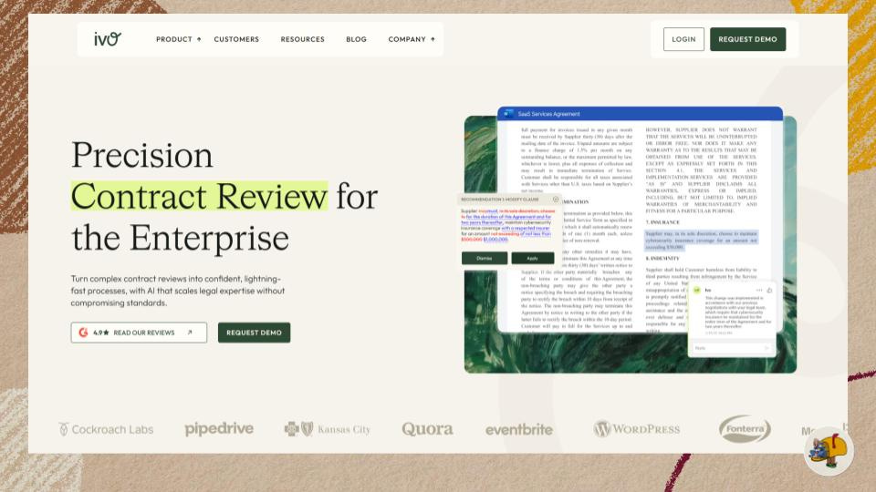
Does it work? Can’t say. The site is otherwise quite “SaaS” with some distinct design assets - but given they’re an AI company I wouldn’t be surprised if these green paint textures are AI-generated, which could signal cheapness to their enterprise customers.
Websites worth waking up to
Mirek Nisenbaum gave a talk for It’s Nice That’s Nicer Tuesdays event series all about website design if you’d like even more thoughts about websites!
🧹Housekeeping
I got the issue numbers wrong (repeated issue 5 twice…) which means this week is actually the second last week of Mehdeeka before it goes on break — and good timing because I’ll be on holiday next week anyway!
For newer Mehketeers, Mehdeeka is run in seasons so I get breaks. I still have a lot of issue ideas I didn’t write this season, so I don’t expect this break to be as long, but it’ll be about 4ish weeks. I’m also going to Europe, so expect me to be maniacally looking at how marketing is different (or the same) there.
Did someone forward this to you?
Looking into my stats, about 50% of my views come from people forwarding issues to other people which is crazy. I’ve talked before about how silent Mehketeers are (looking at YOU 👀) despite the stats on things like forwarding emails.
If you received this from someone forwarding it to you, do me a favour and subscribe!
You’ll officially get to call yourself a Mehketeer too.
Alright, see you next week for a season finale! And then I’ll probably follow it up with some unhinged takes on European marketing.
Signed,
Kayla