


B2B company newsletters: 🎯 or 💩?
Season 9, Issue 3, how to get more signups (or is it?)
📬In this issue:
How a website refresh is a great time to look at your company newsletter signup
Signup design, placements, and landing pages
Copy that converts
Wassup Mehketeers,
Today we have a classic Mehdeeka which is one where I’ve been actually working on this problem for one of my clients over the past couple of weeks, and this is the synthesis of all of my research and pondering. I hope you find this helpful!
The problem (or opportunity):
The client’s website has been growing over the past 1-2 years, and it was getting to a point where the original structure of the site was really reaching the limits of how much new stuff we could keep cramming in.
We’d already re-worked the nav bar to fit more sections in, which lead to this Mehdeeka about mega menus:

We really didn’t want to re-build the website, but there’s a Mehdeeka for that too if you’re facing that behemoth of a project:

And a Mehdeeka YouTube video about it too (the only video I’ve made for Mehdeeka, it’s worth the watch though)
Anyway, we’re back to the topic of this issue. Bloated site, don’t want to rebuild. Time for a facelift then! We were looking at:
Consolidating some of the product pages into a structure that more closely aligns with the 2025 version of the product and 2025 keyword focus
Adding a couple of new supplementary pages
Adding 3-5 new content module designs
A home page refresh
This client also has a super niche but popular and well respected company newsletter. It’s mostly a news roundup of things happening in the industry and links to events conferences. We don’t write any specific content for this newsletter, it’s 99% pure curation. But it gets mentioned all the time by prospects, and it has some huge names in the industry actively opening it every month.
Our existing method of gathering signs ups was through a pop up that would show if you were on the site for the first time for more than 20 seconds. If you closed it, it doesn’t really come back up, and there’s a contact/lead form but not a dedicated newsletter signup form.
With the new content modules, I wanted to get one specifically for newsletter sign ups. So of course I then went deep into researching the module placement, design, and copy.
Design, placement, and landing pages
As with any good research project, I collected a folder overflowing with screenshots.
Caveat: I don’t have the conversion rates for these examples, it’s all food for thought and I am just a goldfish gobbling up my little fish food pellets.
Classic placements
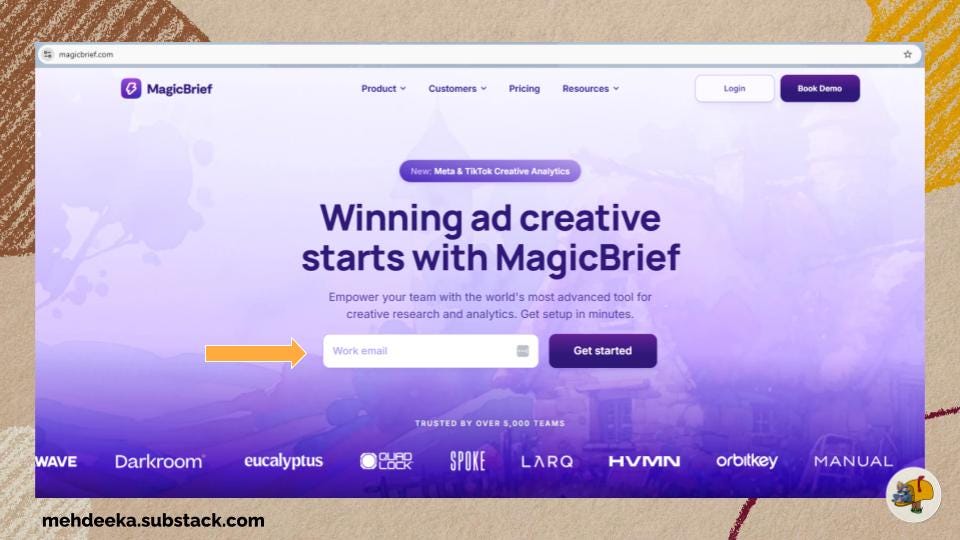
The classic is the email capture above the fold on the home page. If we think through the user journey, the very first thing on your website being an ask for an email address is a bit strong, but it is a reliable placement in terms of being able to come back and find it when you are ready to give up your contact details.
This email capture on MagicBrief’s home page isn’t for their newsletter, which is actually a separate brand altogether, Internet Ads Club. A bit later in this newsletter we’ll get a little look into the why of this as I reached out to Maddie King, MagicBrief’s marketer!
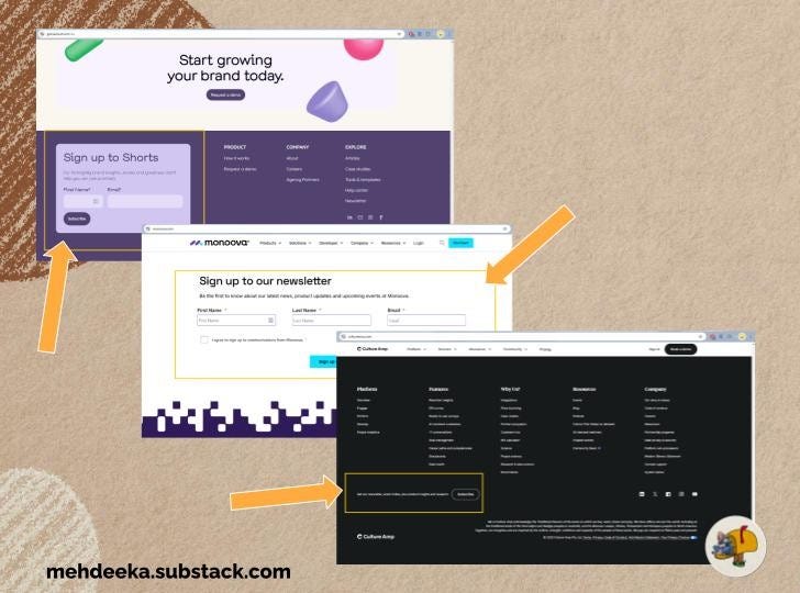
Still within the ‘classic’ category is email captures within footers. Footers tend to have more variation in the designs. Some, like MagicBrief, have it in the list of pages without an email capture.
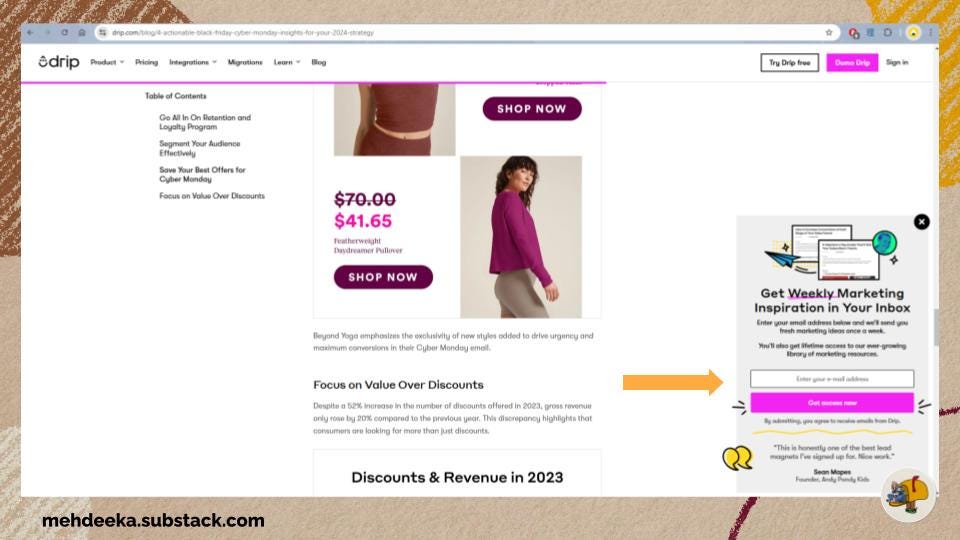
Pop ups
Drip uses a chatbox style pop up to advertise their newsletter. I had to scroll about 2/3rds down a blog to activate this. I do really like how many design elements are in this, there’s obviously been some thought put into it to distinguish it from a regular chatbot or support chat.
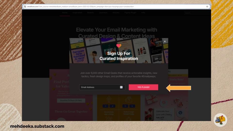
Email Love have the truest pop up I could find, smack bang in the middle of the screen. It was actually pretty hard to find examples of pop ups. I know we all complain about them, but we may have gone too far in the opposite direction?
Perhaps it’s because Email Love is explicitly about newsletters that it’s not considered annoying — or it is annoying and I’m just a little freak hunting for email captures celebrating this pop up find like Gollum with his ring.
Under utilised placements
If growing your newsletter list is a strategic priority, there’s some placements that aren’t getting enough love!
Navigation bar
Mid-page and mid-blog (or floating)
Dedicated landing pages
Early stage websites usually have a ‘blog’ tab in the nav bar. Once you start doing whitepapers or ebooks, this ‘blog’ might change to ‘resources’ with a drop down showing blog, ebooks, etc.
Why aren’t marketers adding their newsletter to this tab!! Positioning it as a resource and not a blatant MQL harvesting exercise builds a lot of credibility.
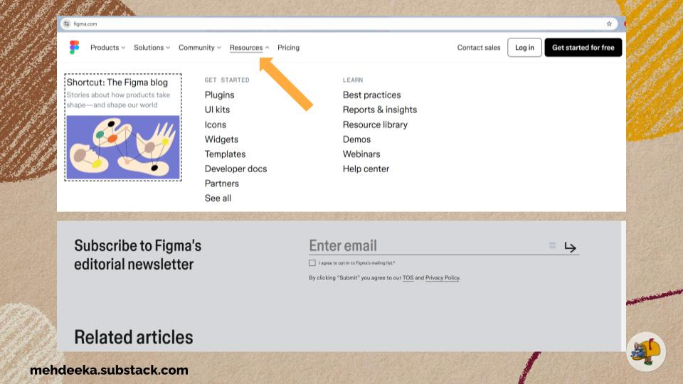
While browsing Email Love, I found a newsletter example from Figma. So I knew they had one. Why was it so hard to find?! They have a resources tab in their nav, with honestly a lot in it. No mention of the newsletter.
I scrolled a bunch of pages hoping to activate a pop up. Nothing. It’s only at the very bottom of their blog pages (just above “related articles”) that a very simple email capture appears.
I’m sure they probably have more newsletter subscribers than you or I can imagine having, but if they achieved that with such low effort then imagine how much more they could capture if they made it easier to find?
Mid-page and mid-blog should be pretty self explanatory. I really like these when the copy for the email capture is customised to the page it’s on. For example, this blog from Figma is all about storytelling. A short and snappy mid-page CTA could say “For more tips on embedding storytelling in your design, sign up to the Figma newsletter.”
They have excellent custom design on this page, which makes the lack of an email capture even more egregious!
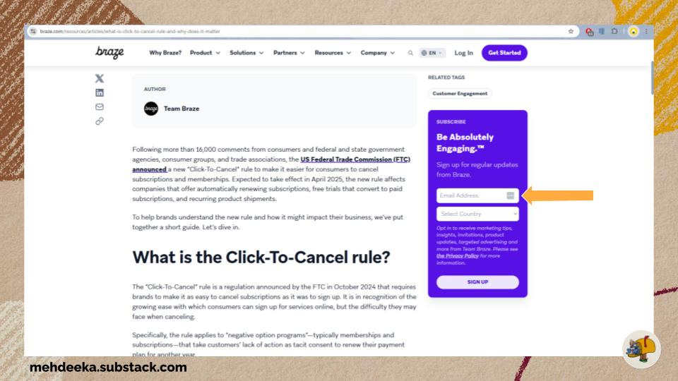
Braze has a floating email capture that scrolls with you down the page. Imagine if this was combined with Drip’s pop up design, it would be a 10/10 benchmark!
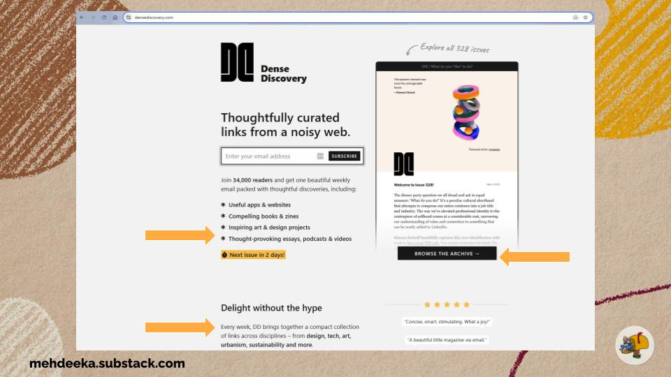
The last placement I’ll touch on is a dedicated landing page. Dense Discovery is in my personal top 3 newsletters, and it’s not attached to anything else, it’s just a newsletter. So, the single page website for it is just one big landing page and it’s good.
And this segues perfectly into the next segment…
Converting people into subscribers
Now, for this section we listen and we don’t judge whether or not Mehdeeka follows the below principles.
First though, a hot take from me. I don’t think bragging about how many subscribers you have, or how quickly you’re growing, counts as social proof. There is no measure of quality of subscribers in that. I also don’t think statements like “I spent 80 hours compiling this issue” work for you either, because if I judge the content to be sub standard then I just think you’ve wasted 80 hours of your life? And how can I believe you anyway, where’s your timesheet?!
What I do think makes for a compelling reason to sign up is:
Basic information. How often will I get this, what does it cover, can I see a sample issue. Doesn’t need to be a whole archive, but what am I signing up for? Set my expectations so you can then meet or exceed them.
What’s the value proposition of this newsletter? Will it educate me, entertain me, or be a discovery tool for cool things? Are you going to curate the most interesting industry news stories and save me time from having to do that myself?
For a company newsletter, clarity on what kind of newsletter it is. Product updates? Industry news? Blog updates? Again, setting expectations. “Get the latest news and product updates” is not good enough.
Some of the better copy from the examples I’ve pulled for this newsletter:
Get weekly marketing inspiration. We’ll send you fresh marketing ideas once a week. You’ll also get lifetime access to our library of marketing resources (Drip)
Sign up to Shorts for fortnightly brand insights, stories and goodness that’ll help you win (Tracksuit)
3 winning ads, 2 brand highlights, 1 curated ad collection — every two weeks (MagicBrief/Internet Ads Club)
Receive actionable insights, new tactics, fresh design inspo (Email Love)
Maddie spills the beans on MagicBrief and Internet Ads Club
I asked Maddie King from MagicBrief two questions:
What was behind the decision to separate MagicBrief from Internet Ads Club?
Maddie: In the early days of brainstorming a newsletter I wanted it to look and feel like “not a B2B SaaS newsletter” and be something that people would actually enjoy subscribing to and being a part of, agnostic to being a MB customer — no one actually wears B2B saas merch/company merch — but Internet Ads Club as a separate brand is something people would actually be proud to wear and be a part of. A big insight here was that performance marketers (i.e. people who make internet ads) don’t get the same kudos and recognition as traditional advertising and I saw an opportunity to celebrate these people and their work and have some fun along the way and build community. I think the “soft sell” works well in this way!
What is the customer journey like between the newsletter and MagicBrief?
Maddie: We dont have amazing tracking but we have RAVE fans who love the newsletter and sign up to MagicBrief without even realising the newsletter is associated with us!! I’d say the it is definitely TOFU + community — but the repeated organic exposure to MagicBrief in the emails themselves also works well for MOFU and nurturing!
And that’s the round up
I’d love to know, after reading this issue, are you going to review your company newsletter game?
That’s all from me today, see you next week!
Kayla
amen! ty