


They don't make 'em like they used to 😩
Season 9, Issue 8: Ads round up with a twist
📬 In this issue:
I scrolled through thousands of ads to pick out the best ones
The twist is they’re ads from a long, long time ago!
Taking a look at distinctiveness and effectiveness
Hola Mehketeer,
I’ve been finding news things to replace my chronically online doom scrolling, and 1st Dibs is a great website for endless scrolling with a clear “that’s enough” point. It’s basically a rich person’s Facebook Marketplace where the “I should log off” point is finding a wooden box listed for $80,000 (not a joke, see here.)
However! There’s something to be said for this being a cool way that old stuff has been archived rather than lost to time. Of interest to us today is searching “advertising poster.”
Long time Mehketeers know I love the history of artists working in advertising (see the bottom of today’s email for the links to past issues about this) and the ads round up I did in season 8 is one of the most popular Mehdeekas of all time — so I thought let’s combine them!

All I did for this was use “advertising poster” in the search bar and then glaze my eyes over and scroll until something jumped out at me. Let’s dive in.
What can we learn from old ads?
All of the below ads excel at one of more of these elements:
Distinctive, bold visuals
Simple, memorable copy
Not afraid to be daring
Contemporary ads cram so much more information in than these older ads. Depending on the channel we have to add different information like what to google to find the product, or a web address that no one will remember, or a QR code to circumvent that. We have to make sure the brand is distinct because we have so many competitors, while fitting in the value proposition, and on top of all of this, drive an emotional or campaign-level message home.
Is less more? Are the below ads any less effective because they don’t have all of this? Or do they just achieve it in a different way?
Let’s start with some recognisable brands!
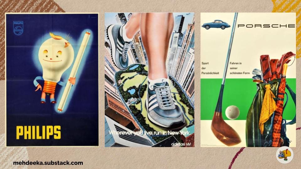
Philips
This 1940s poster has the logo, an anthropomorphised light bulb holding another light bulb (does the Philips universe have cannibalism?!) and then the brand name.
What I want to call out about this one is that there’s clear information being conveyed. The logo is subtle but the name Philips is bright yellow against a dark background (symbolic of a light), and then there’s the light bulb man so this is unmistakably an ad for a light bulb.
Would this work today? Absolutely not. But can the information in your ads be as clear and concise as this?
Illustration by Frank Nanninga.
Adidas
I love the perspective of this one. It takes two things we know really well (running, and the place running happens in) and presents them in an unexpected way.
The name of the shoe style is “New York” which is why the slogan is “Wherever you live, run in New York.” Overall, this would be scroll-stopping in 2025, not just because of the perspective but also the art style, there’s something optimistic and futuristic about it.
Porsche
So there seems to have been a whole series of posters with this green stripe. Which is such an easy, repeatable motif to create brand recognition when you don’t have a lot of assets to work with.
The slogan is something like “sport of personality, driving in its most beautiful form”, but here we have a focus on the value proposition of this car. Any car will get you from A to B, this car matches your lifestyle and offers a premium driving experience.
Artwork by Hanns Lohrer.
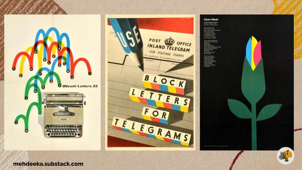
Olivetti
I picked this Olivetti typewriter ad because it’s the closest thing to software (lol.) It’s so simple, but so clear. Even though the bouncing letters don’t spell anything, the movement of the colours shows fingers flying across the keys with speed.
Design by Giovanni Pintori.
British General Post Office
I’m including this because I just love the use of colour and type to really grab attention. The whole genre of government PSA advertising is so fun to me because they’re really just focused on delivering a message and not trying to get you to buy anything so it’s a unique context to be advertising in.
London College of Printing
This poster is for the London College of Printing’s open week in the mid-1970s. The context of this is really interesting to me as well, a printed material for a printing service (in this case an educational service) is like the ultimate form of building in public, right?
The B2B SaaS version of this is almost having an ad with your code in it and being like “is this not really elegant code? We’re good at coding, use our product.”
People who appreciate the craft are basically your super users or internal champions, how could you build a campaign to appeal to that type of person?
Illustration by Tom Eckersley.

Guiness
You know who was the original unhinged marketing? Guiness beer. This is a small selection of an insane series of posters that encouraged drinking in all scenarios and times of day.
This happy smiling man has a debilitating alcohol problem. The face in the foam will haunt me.

British Ministry of Food
“Milk is the backbone of young Britain” literally and figuratively in this poster. I dislike the bottom banner because it doesn’t feel like it matches the illustration, but I really like the pink outline and the glowing milk bottle.
What this poster and the next poster have in common is having a strong, singular concept that’s given a not-so-intuitive visual interpretation.
Design by James Fitton.
Soviet butter
This one reads “butter is your energy”. It’s another visual interpretation that isn’t the first thing that comes to mind, but the link is still obvious and clear.
These two posters really highlight the value of having an actual designer or illustrator to work with. Marketers are great at concepts, but we’re not designers. This is why the golden days of advertising had dedicated art departments!
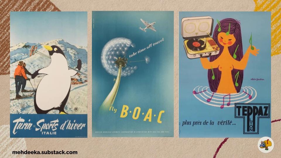
Turin, Italy
This poster for winter sports is one that I could see working in 2025 (with some updates.) Photography enhanced with an illustration that builds brand identity is again, a scalable, repeatable way to build a brand without a huge asset library. Granted custom illustrations are expensive, but you could invest in a well thought out initial library of assets for various uses and stretch them as far as you can.
I think this was the initial idea for the Corporate Memphis trend from the late 2010s, but this trend was so devoid of character and identity. Compare this to the Philips light bulb man or the Guiness guy, they had so much expression and individuality that brings them to life.
Illustrated by Campagnoli Adalberto.
BOAC
It was really hard to not have this whole issue just be travel posters because they are so iconic.
Vintage travel focused on the activity you’d do or the feeling you’d have when you go to your destination, rather than how you’d get there. This one in particular focuses on the sense of adventure, and saying BOAC is so luxurious it’s not “travel”, it is the holiday itself.
Notably, this one has a CTA! Fly BOAC.
Teppaz
I saved my favourite for last! This mermaid is for a portable record player, and the French slogan says “closer to the truth.” Truthfully, not sure what that means.
I love the music notes mixing with the water ripples, the overall composition and balance, and again I think this could work in a modern digital setting with some updates.
Designed by Alain Gauthier.
Do any of these brands still use any of these elements?
Notably, the Philips logo is almost identical. Adidas very much still retains the essence of the poster, with lots of city-based running photography. Porsche’s latest advertising is very futuristic so it’s quite different.
A lot of the other brands have either gone out of business, been merged into other brands, or raging alcoholism is no longer an acceptable approach.
All trends are cyclical, and in a world of AI-generated content, advertising that incorporates human-made artwork might come back as a signifier of a brand’s premium quality. That brand can afford to pay a craftsperson, can afford to use luxury production methods.
Last though — have you ever watched a live adaptation of an animated show or movie and realised just how much the animated format lets characters be so much more expressive without being corny, terrifying, or cringe? It’s the same with the current push for photography of human models in advertising, sometimes your idea is better expressed by an over the top cartoon character.
Bringing it back to B2B SaaS
Some SaaS brands doing premium illustration work include Culture Amp, Miro, Figma, Slack has an evolved form of the Memphis Corporate style, and Zendesk.
These are all large brands with established identities. An example of two smaller, Australian startups that are doing really well in terms of creativity, distinctiveness, and limited resources are Brainfi.sh and Twine.so
P.S. Brainfish founder Daniel Kimber was interviewed in a previous issue!
There’s so much you can do with a strong colour palette, some shapes or patterns, and artwork that’s in the public domain.
And as promised, previous Mehdeekas about art!


I hope you enjoyed this,
Kayla
Now I'm wondering if the absurdity used to promote raging alcoholism could be rechanneled to promote some other (less culturally frowned on) addictions that could work in my own favour.... I think we're past being able to promote raging wastefulness of disposable products, but what about raging addiction to purchasing unnecessary power tools, or excessive compulsion to overstock on respiratory protection?