Hi!
I’m breaking format for this week’s issue as I have a bit of housekeeping to do. First of all, it’s been 12 straight issues of Mehdeeka since my last break, which means it’s time for another one. I’m going to be sending out a “best of” recap next week and then I’m taking about 3 weeks off (and I have actual annual leave to look forward to, not just leave from this newsletter!) so you’ll next hear from me in mid-late May.
I do have a mini topic to go over today, and I also have a reader survey I would really appreciate if you completed - it’s just 7 multiple choice questions!
If you’ve liked the last 12 weeks (and the ‘season’ before that too!), another huge way to support me and this newsletter is to share it with someone in the industry, or in general on social media!
Now that that’s covered, onto today’s topic:
Finding marketing opportunities in your SaaS product
The last few issues have been heavily focused on customer acquisition so let’s go the opposite way, and go over a few areas within your product that you can optimise for further marketing. I’m going to go over two examples;
In-product promotions
Creating ‘virality’ and features that promote customers sharing your product with non-customers
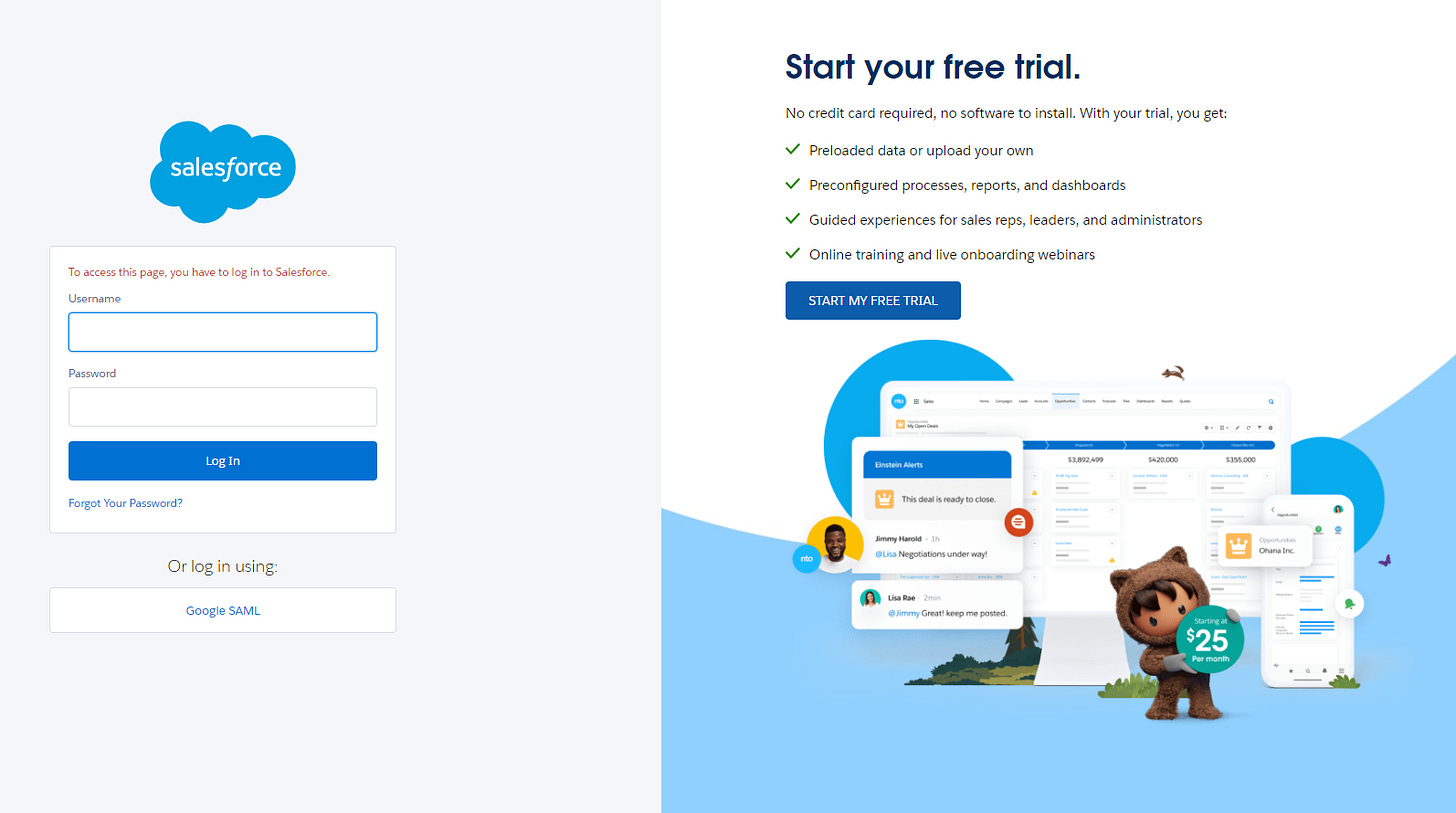
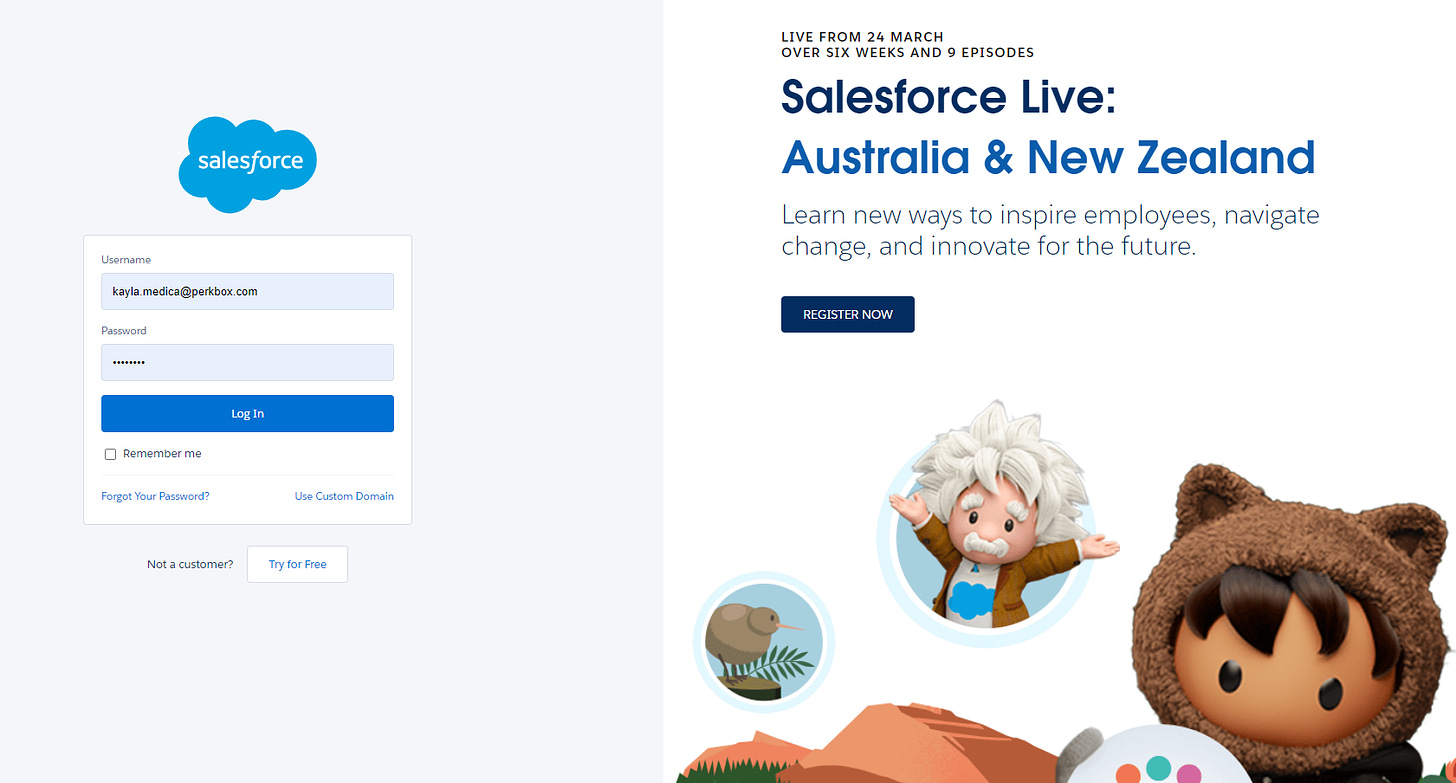
On the first point of in-product promotions, Salesforce use their login page really well, with a very clear login form on the left and a promotion that’s not too distracting on the right. Here are two current examples, the first with a free trial:
And the second promoting Salesforce Live:
Is there any way you could optimise your login page? If you don’t make users login repeatedly, you can optimise it for the onboarding experience and keep it static, otherwise it’s nice to change it up and keep it timely.
My second dot point was creating virality within your product. What I mean by this is having something in your product that just makes people impulsively want to share it. Perkbox (my day job) has an inherently feel-good product, which is Recognition. TL;DR, you can send your colleagues recognition for doing something nice or helping you.
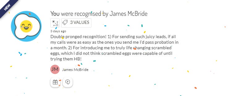
When you receive recognition on the platform, there’s a confetti animation on the recognition you received. Here’s what it looks like:
(side note: the eggs mentioned here are from Cre Asion, near Museum Station and I highly recommend them. If you don’t think I take eggs seriously, my employee avatar is literally an egg. I don’t joke around)
When you receive recognition, it is a really warm and fuzzy kind of emotion, and a nice screenshot of it shared LinkedIn is a marketer’s dream. There’s room for improvement in the design of our product though, for example, if the goal is to make recognition optimised for “virality”, then a square format with less unused space, the 3 tagged values actually being shown instead of needing to hover on it, and generally just a bit more thought into what goes where.
Designers, developers, and product managers don’t think about things like making a user share your product on LinkedIn (or write Google reviews, or word of mouth), so you need to be that voice. Take an hour to go over your product and see where these kinds of optimisations can be made, and then speak to a product manager (or whoever is relevant) about your ideas. Often times we’re not asking for a lot - my two examples are really just front end work - and so they might surprise you with how quickly they get to it!
Directions to destinations unknown
PlayLab’s work, highlighted in It’s Nice That, is just really nice to look at. The art/design firm has a philosphy of never doing the same thing twice, I for one am a fan of the idea of trying something and then never trying it again.
If you don’t know gong.io, they have really good blogs about sales tips, including a LOT of A/B tests and data collection from thousands of sales emails. Here are their 7 tips from 2020.
Peloton’s internal brand guidelines ended up on the internet, and they are actually really good. I have spoken about giving yourself restrictions before, and I find Peloton’s really interesting, for example they have a rule that their “heros” (aka models) must always be shown working hard with a satisfying climax at the end of the workout because they want people to understand that they will need to put in the work after purchasing the bike.
This opinion piece in Bloomberg talks about the next big branding trend, which they’ve labelled “blending”. It’s a bit of a load but there’s some interesting points in there so it’s still worth the read.
Finally, a bit of fun! CNN made a game where you try and steer a ship through the Suez Canal. It is surprisingly hard. I even tried to do it suuuuper slow, and then a high wind pushed me into a collision. If you make it though, please let me know.


