

Deep dive: Expanding to multi-product
Season 10, Issue 1: How Little Chonk's website changed with product expansion
📬In this issue:
Checking out ecommerce brand, Little Chonk’s digital presence
How their website changed when they went from one product to multi-product
Learnings for SaaS from non-SaaS brands
Bonjour Mehketeers,
Welcome to season 10! Sorry for the extended break, it’s usually 4-6 weeks and this break was… twenty. As I mentioned last week, I’ve been busy and honestly the longer I put off writing the more I actually wanted to write, but then the more guilt I felt about letting it go so long.
We are less than 12 weeks away from the end of the year, so I’m just gonna keep this going for 8-10ish weeks until we get too close to Christmas. Season 10 is all about the following the vibes.
One of the big pieces of work I was doing in the past 20 weeks is building a one-day in-person workshop all about when, where, and how to present pricing. It’s less about coming up with the price itself, and more about how positioning, copy, and brand can all be used to present your price in a more compelling way.
I’ll be announcing the next class soon. It’s currently limited to in-person only, and you can register your interest and city via this link:

S10!
To kick off Season 10, I’m doing a deep dive. I’ve had this brand’s website saved for ages — in fact, too long. I saved it because I was so impressed by the blend of product marketing, brand marketing, and functionality in the site. I then finally revisited it for this issue to find they’ve re-done the site!
After using the wayback machine to compare the site at different times, I was able to piece together the progression the structure of the site went through as they expanded from a single product to multiple products:
Brand launch, with one product and basic page structure (home, features, about, FAQ, and “buy” CTA)
There’s a greater emphasis on the founder and the story behind the brand
The original product gets a V2 update, and one accessory product is added (Lil Gulp), prompting a website update that includes adding animations, an email capture pop up, and more pages to the site
Future product releases go through a kickstarter, with banners and campaigns on the website
That brings us to today where there’s been quite a lot of redesign
I capture the home page at three points in time and built a comparison:
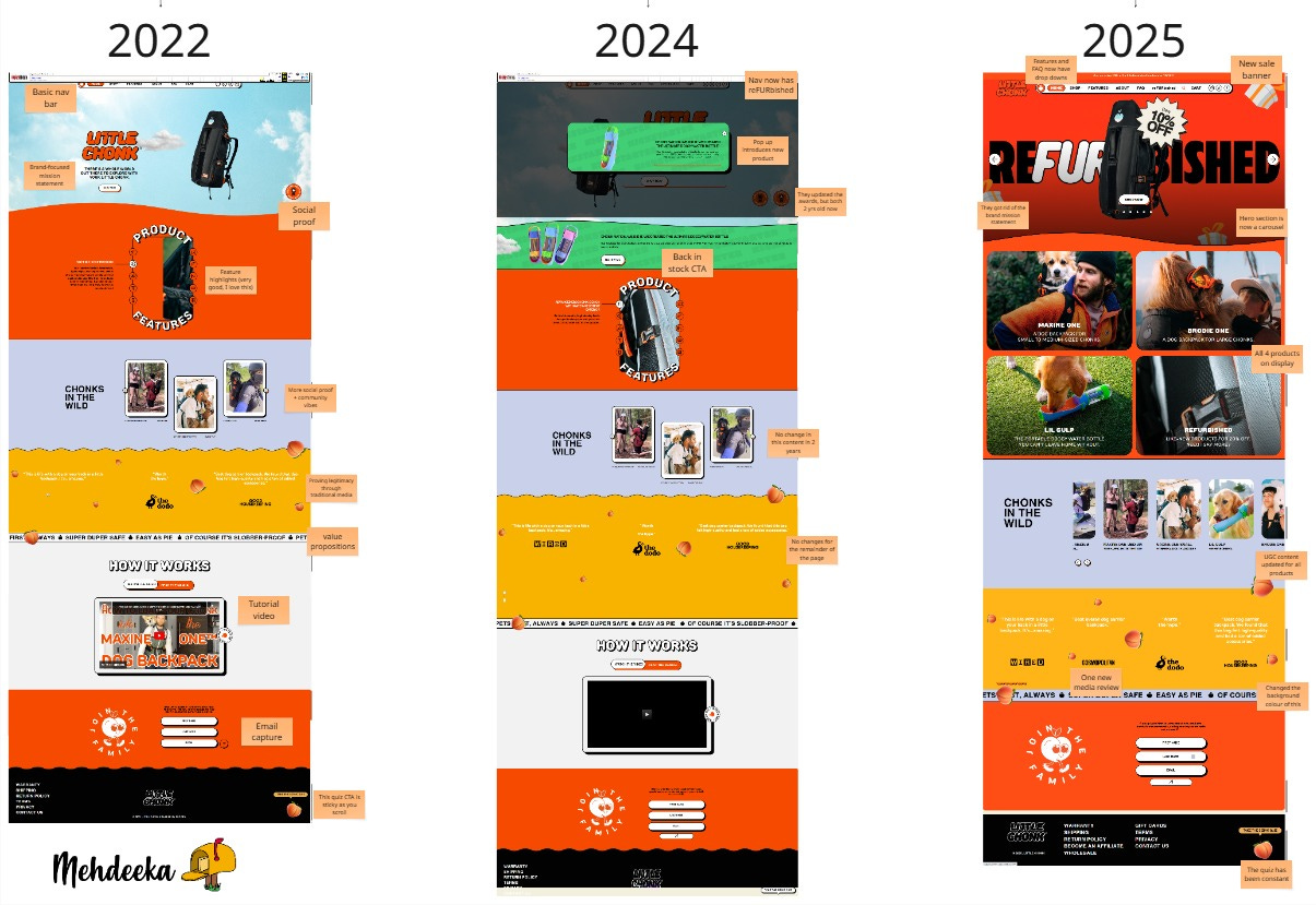
On each of the home page variations I’ve provided some comentary that highlights what changes across the years. The highlights of the 2025 version for me is they learned to keep the awards they’ve won on the hero section but take out the reference to the year they won them (lol), are now equally highlighting all their products, and have, despite 4x-ing the number of products they have, kept the length of the home page generally the same.
It’s pretty common that home pages end up being the “everything for everyone” and become super bloated. There’s a real art to a succinct home page that still explains what the products are.
What SaaS can take from ecommerce product marketing
This is easier for simple products like e-commerce, but we SaaS marketers can still use them as a mirror to see when we’re overcomplicating things. Last year I highlighted how good the Hobonichi Techo website is along the same lines as this, see below:

My favourite part of this whole website, and what originally made me want to do a deep dive on it, is the feature carousel module they’ve built.
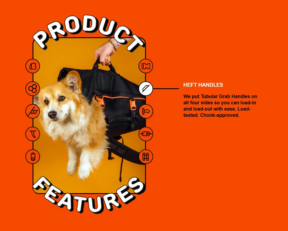
Not only is it visually interesting and interactive, the copy is fantastic. It embues the value propositions with the brand tone in such a cute way:
Advanced ergonomic design with water resistant exterior
Built with durable, high-density fabric designed to keep you and your little chonk comfortable and fully supported.
And
Tail port
Now your chonk can let their fur flag fly. But it’s not all fun and games. Using a tail port will decrease pressure on your pet’s tail, while maintaining circulation to the area.
Possibly my favourite
Floof guard 1.0
Keep your baby snug and strapped-in without constricting their widdle arms.
They also keep things really straight forward. They use practical headers like “how it works” and “product features”. There’s very little fluff (pun intended.)
Somehow it feels like SaaS marketers have come to see this as too obvious or not fancy enough. It’s not “overdone” if it’s simply the clearest way to communicate something.
I definitely recommend taking a closer look at the home pages and the changes between them on the Miro.
I finished writing this 11:22pm the night before
Old habits die hard apparently, even with issue 1 of a new season. Somebody slap me. I’m actually going on a holiday next week, so the next couple of issues will be pre-written (!!!) and maybe (?) proof read.
You can always reply to these emails with:
Thoughts and comments
Praise
Reprimands
I’ll be in Japan and Korea, if you want to follow my (legendary, amongst my friends) Instagram stories of the trip you can find me pretty easily on IG. Hint: I’m literally Mehdeeka everywhere.
Love you!
Kayla
I'm also crazy. I finished last week's edition, wasn't happy with it, got up at 5am and rewrote it before going in to the PAX Expo. Please send some slapping my way too.
LITTLE CHONK is a fantastic name