The Mehdeeka guide to interactive product demos
Season 5, Issue 9 and a reveal of whether chatGPT wrote a Mehdeeka issue
Warning, it’s another long one today so you might want to save this for when you’re in the mood to read!
Last issue, I mentioned the Gong interactive demo that I thought was not as well done as it could be. Usually I’m a pretty big fan of Gong and I have recommended them as a marketing inspo/resource/best practice several times, so I was pretty surprised by how lacklustre their demo was.
Following the popularity of product marketing and demo videos, interactive demos are still on the up and up and are definitely the next big trend. Navattic is the name I’ve seen come up most often, Storylane is chasing them down, and HowdyGo is a local Aussie alternative.
Instead of just being like “this sucks” I wanted to break it down and put it out into the world so I’m not letting my dreams be dreams.
The Gong example
Alrighty, the first thing we see is a header, naturally, and then a sub header which is already kind of getting it wrong:
Start the self-guided tour and see the magic of Gong in action!
Before I started thinking about interactive demos too deeply I wouldn’t have seen anything wrong in this, but now I’m a bit more pedantic. It’s not self-guided. Sure, it’s self-paced but that is a different story.
If we (marketers) want people to feel like they’ve had any sort of control or depth to a tour, we need to give them more to tour. One of the features I think is not used or emphasised enough with these interactice demo platforms is the ability to strip out parts of your product so that it’s not distracting. I’ll expand on that in a bit, let’s go back to the Gong example.
It says here, “Welcome to the Deal board” and highlights the biggest number on the dashboard. But is that what this tour is really doing? I don’t think this intro is actually reflective of what happens in the demo:
If this really was an “interactive” demo, I’d be clicking all over finding out what everything is, but all the items circled in red don’t ever get addressed in the demo, but are shown in full detail. If these items were simplified or blurred out (which is a feature of some interactive demo platforms) then my natural state of being a busy body wouldn’t be triggered. By showing me an incredibly detailed dashboard, I’m both intrigued and overwhelmed.
Here’s a quick and dirty screenshot of a simplified platform from Perkbox (yes it’s an illustration but my point stands that this is a feature in these platforms)
My brain knows intuitively to ignore the bits that are greyed out - those aren’t important.
The Gong demo jumps around quite a bit, the platform is animated as scrolling and things like that, and it’s all so fast. One thing I have learned through doing demo videos is that you’ve gotta go slower.
Slower than you think.
And then even slower than that.
You, the marketer, and your colleagues, the tech employees, are not representative of your buyers. Your buyers are quite likely to include people who might not be the most tech savvy, who might have gotten used to being able to replay a demo video over and over, who might take a little extra time to “get” it.
Anyway, back to Gong.
This side overlay appeared without showing how we got there. If you’re writing the captions for an interactive demo, please, I beg you, consider yourself the navigator in the passenger seat and your customer is driving a car in a foreign city. You’re reading the google maps instructions, letting them know it’s the second turn on the right, the exit is coming up in 2km, and so on.
I don’t want to feel like I was confident in driving straight and then you say, “oh yeah, you were supposed to turn back there.” That’s what this feels like, especially with no ability to go back a step! (For the record, HowdyGo does have a back button)
You don’t need to point to every single item on the screen, or tell me every button you click, but that’s exactly why the feature to remove things from your product is there.
Don’t be afraid to have a few notes on a screenshot without moving forward. This slows it down, allows people to feel oriented before you move them along, and most importantly gives them confidence. If a potential buyer doesn’t feel like they understand what you do and have confidence in their ability to sell it internally, then they’re not even going to try.
The Navattic example
Oh you know I am not satisfied with one example. Gong are marketing leaders, that’s for sure. But Navattic are interactive demo leaders, so surely they’ve got some good stuff happening?
Well, I had a look and it was not as good as I was expecting!
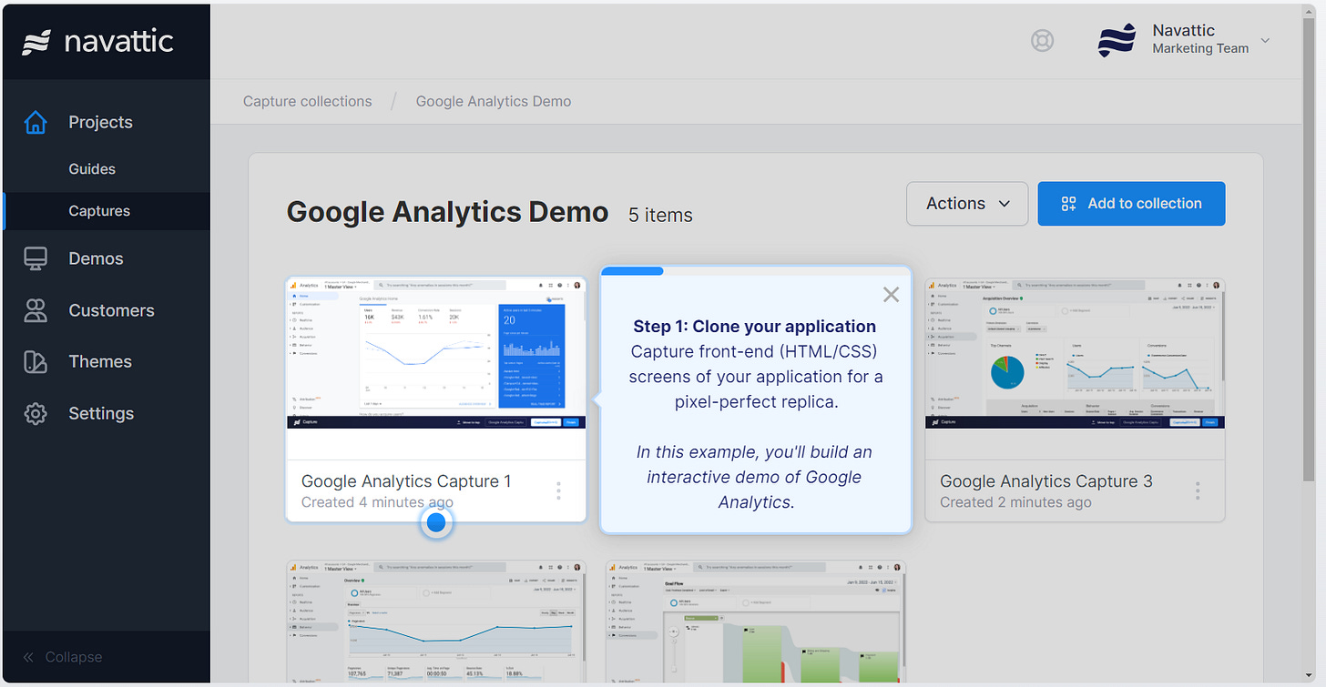
We started off strong with an intro message that set the expectations for what was going to be covered:
Great, we’re going to be completing a task, a very good use of an interactive demo. Then what’s this? Oh no, we’ve skipped orientation and gone straight to action:
What would have been nice here is a little message like the Gong one - “this is the Captures feature, where you create your demos.” Instead, I’m seeing a menu with seven options, and five tiles in this clickable section, but we’re just not going to talk about that? I’m already stuck on a roundabout with no idea which exit to take.
Furthermore, the actual copy itself could be improved by just following basic marketing principles of highlighting the value to the customer. Why are we cleaning captures? It’s not just about messy demo environments, it’s leading the customer to where you want them to look, to keep them focused, and to ensure you’re highlighting the best parts of your product.
Recap of the lessons
Think of your interactive demos as an in-person date:
Dress nicely, hide the stains on your clothes - simplify what you’ve got on screen
Pick up your date and go for a romantic walk before you get to the restaurant - don’t just jump into “click here”, “go there”, but instead give a bit of tour of what’s on screen before directing them to one single button to progress to the next slide
Let your date pick what they want to eat - Dooly has an amazing page of multiple product demos based on use case so people can self-select (although the demos are good, there’s still room for improvement in them, but the page itself is great)
Keep the conversation flowing - don’t let your copy be what makes your demo lacklustre!
To show these in action, I screen grabbed an entire Dooly demo and annotated it.
This is also linked in my resources spreadsheet, which can always be found in the footer of every email.
I showed Tom Bruining, founder of HowdyGo, these annotations and he gave me his two cents on where marketers should focus:
1. Primarily: Provide additional context and set the stage for why the interaction is valuable. Pointing out things like "Green is good" isn't very helpful. Keep it valuable, or focus on moving them along.
2. Secondary: Explain the interaction and carry them through to the next step.
An affiliate discount?!
Welcome to the very first affiliate discount partner for Mehdeeka, HowdyGo! This Australian interactive demo startup has been incredibly generous and is offering Mehdeeka readers 20% off - just contact me via a reply to the newsletter, a comment, or email me (kaylamedica@gmail.com) to get set up with the discount code.
Things that I found in the past 7 days
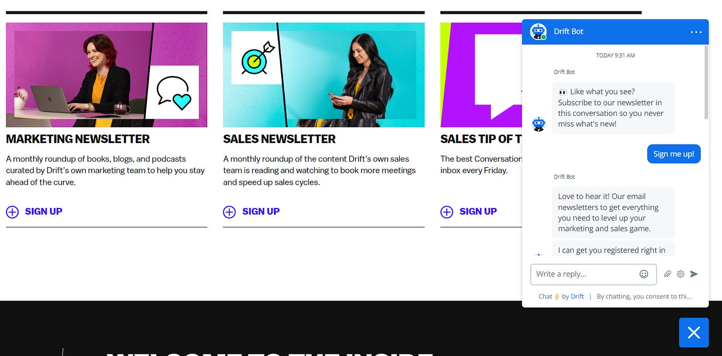
I was super surprised to see Drift use a chat bot to sign people up to their newsletters. Don’t do this. I had to click “sign up’” which triggered the chat bot, then click two more buttons inside the chat to confirm I wanted to sign up, type my email, and then confirm which newsletter I wanted to sign up to, even though I clicked the “sign up” button under the marketing section… exhausting for no reason.
Previously I shared PeerSignal, and now I’ve found SaaSScreenshots. Basically the same thing (collections of screenshots of websites) but this one is bigger.
I haven’t shared art or visual inspo in a while, so here’s an article on Emilie Soto’s illustrations, which remind me a lot of Clement Thoby’s work. I really want to buy an original from Clement one day, and now I might add Emilie to that list!
Last find for this week is the news that Meta/Facebook are releasing an Instagrammy rival to Twitter. I have been following the hype around the “next Twitter” since the Elon takeover was confirmed, and none of the options that popped up ever seemed like they would actually take off. However, the peeks that we’ve gotten of this new product, and the fact that all your Instagram settings can be transferred automatically (including blocked accounts and keywords) makes it seem like the most seamless option for setting up a whole new social network with minimal effort on the user’s part.
What’s all this about ChatGPT?
Ok shout out to Axel for sending me this message the other day:
It really got me thinking that I have gotten this comment a lot (that people can read things in my voice and I have a very distinct tone) and I thought since I have so much writing on the internet, could ChatGPT realistically imitate me?
Sounds like it’s time for an experiment, right? I decided to write this week’s issue, then retrospectively write a brief for ChatGPT to try and get it to generate its own version, and then compare how close the two are, in subject and in tone.
I’ll be revealing more on how that experiment went next week, and admitting if any of this issue was written by someone or something other than myself…


