How to market... your price?
Season 7, Issue 5: Displaying and positioning your pricing is more complex than you think!
📬 In this issue:
A summary of a recent pricing page re-vamp project I worked on and the pitfalls of pricing pages/sales materials
A short library of the elements in a pricing page and when they make sense to use
How pricing is positioned in other assets like pitch decks and proposals
Cómo estás Mehketeers,
Putting aside pricing models, there’s a big debate in SaaS about whether or not to even publicise your pricing.
If you’re in the “nah don’t post your pricing on your website” camp then I guess close this tab because this issue isn’t for you. We’re going to be looking at different ways of displaying your pricing (i.e. web page and sales materials design) and ensuring it’s not more complicated than it needs to be.
Personally, I think there’s a valid time and place for not putting your pricing on your website: When it varies and depends on complex factors like how many products, with different pricing tiers within each product; or huge variation in pricing per user between 10 users vs 1000 users and you don’t want people to see the bulk discount price.
But if it’s something more straightforward, like $ per user, or $ per usage unit, then why increase the friction? There’s nothing worse than sitting through a sales call only to find out right at the end that it’s wildly outside your budget.
Let’s get straight into the nitty gritty.
Pricing on websites
So, I recently redid the pricing page for one of my clients, and I want to walk through each section of it and why I made the choices I made. First up, the header.
Headers and taglines
I actually got really stuck on the headers in the page. I wanted to add the positioning and value propositions in, and not just have a “here’s the price”.
I wanted to remind the visitor about all the good things they’d just researched that convinced them to click on this page in the first place.
If you’ve got a strong brand, your tagline might be enough. Or, on the opposite end of the spectrum your brand is strong in a way that allows you to simply put “Pricing” as the page title.
I went with the company tagline for the header, general value prop for the subtitle, and then actually went in on an additional value proposition in the H2 above the pricing table.
There’s a bunch of value in what they don’t charge for - i.e. unlimited users - and I wanted this to be highlighted, so it’s in the H2.
FAQ sections
Here’s the style I went with:
We added in an FAQ to the Adiona page to clarify even more about exactly what was included in each plan. As you can see above, it was a simple layout, questions on the left, answers on the right.
Here’s a different style of plan comparisons, this one includes a theme drop down and a ? hover that expands on definitions and FAQs from Ortto:
Personally I don’t love this. I had to pick the drop down with the least amount of variables in it just to fit it in a screenshot. If it can’t all fit on a desktop without scrolling, then you shouldn’t use a format like this which requires the visitor to retain info like which heading goes with which column while they read.
The amount of drop downs to choose from was also a bit overwhelming, and when they expand each of them are pretty large.
Ortto also just has “Choose your plan” as the header, so I think they could improve that copy and then simplify what’s on the page.
LinkTree have solved the table issue by keeping the headers fixed while scrolling so they’re always visible:
Tier/plan layout
The most common way to lay out your plans or tiers is classic three tier layout, like this:
It’s starting to feel a bit dated, though. Like when everyone has the same illustration style. Rather than following design trends, it’s better to go with simplicity and clarity.
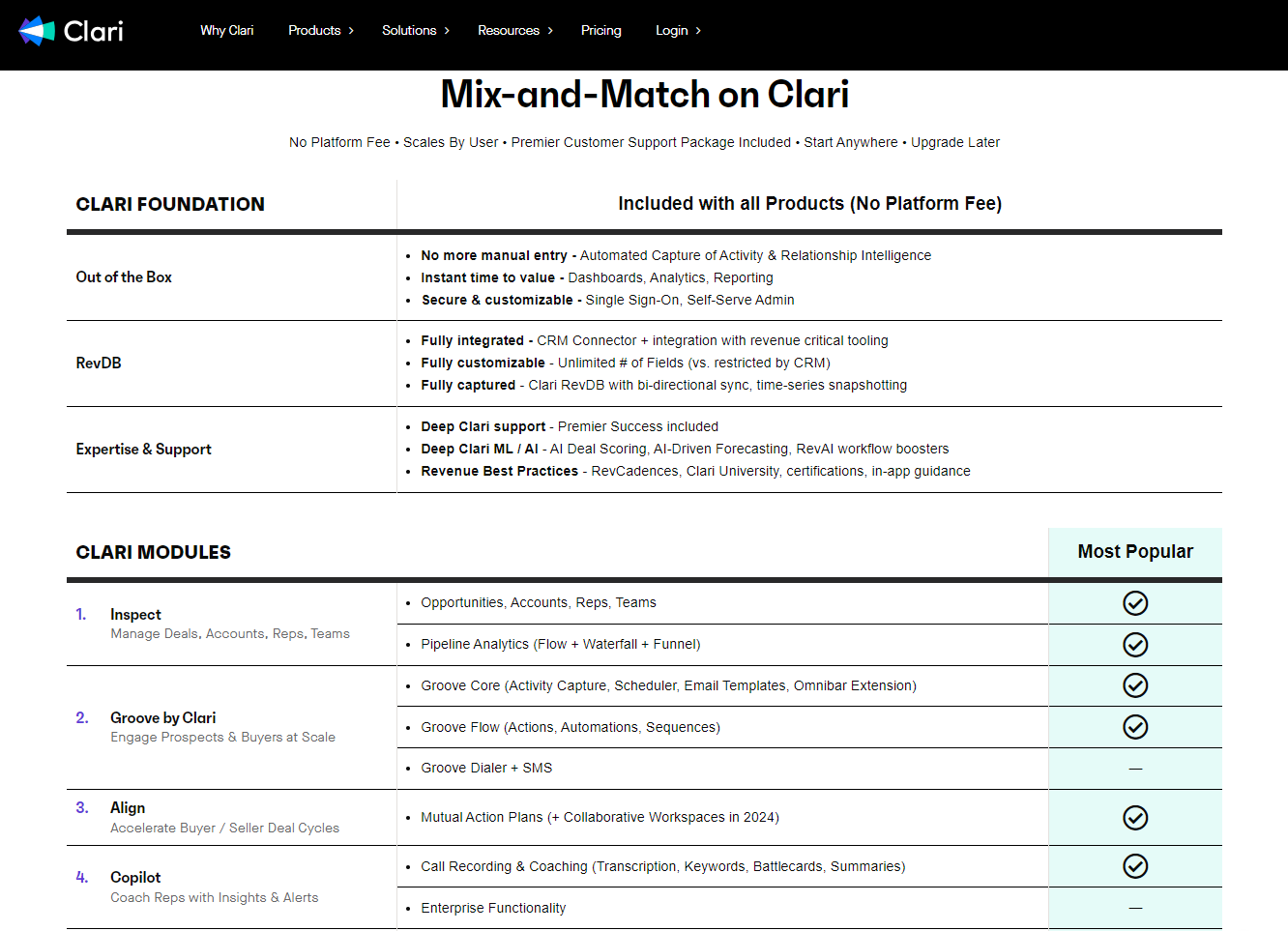
With that in mind, let’s look at Clari which has what I at first thought was cluttered but changed my mind about:
That top table is the inclusions that every customer gets. I think this could be made to stand out more - the text description blends in too much and I missed it even though I was looking for it.
The second table is a bit of an a la carte menu - modules you can pick to add onto the foundations. The “Most Popular” column is confusing, only 3 out 11 line items aren’t highlighted, so why bother?
I’d take that green and use it to highlight the foundations in some way, and just not have the popularity marked. If everything’s popular then nothing is popular…
Overall I do think once you’ve oriented yourself, this is a good product module layout and breakdown that’s easy to understand. To get an actual dollar amount you have to inquire though.
Adiona’s original pricing page was pretty similar to the classic 3 tier structure. We changed it to a table because it was more intuitive to read and we all had less questions about what was and wasn’t included.
There is a free trial available, but we took it out of the pricing page because it’s well advertised on the rest of the site and it’s not self serve, you’d still need to submit a form to gain access to a sandbox environment.
Extras (web page versions)
We added testimonials to the Adiona pricing page to drive home the reminder of the value, and reinforce the social proof:
Dovetail have this CTA to build a proposal which I think is pretty neat. Building a business case to take to your boss together with the pricing is a smart customer journey insight, and whenever I’ve had a sales person help me put this together I’ve always really appreciated it.
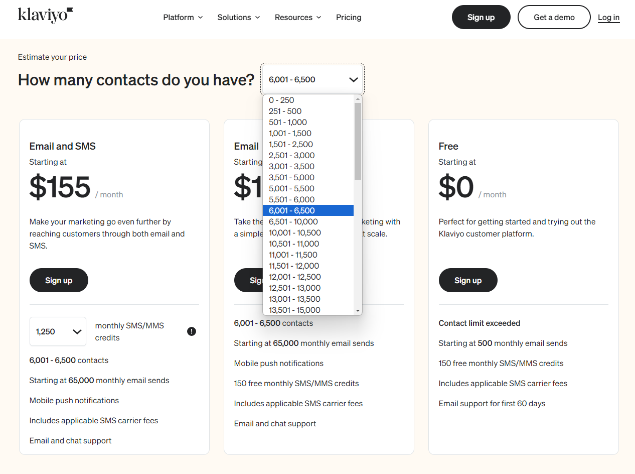
Your pricing might be dependent on factors that are well known. Klayvio have a responsive pricing table where you can input how many contacts you have and know how much you’re going to pay:
Twilio also has similar interactive calculators:
Shockingly, seeing ROI numbers weren’t as common as I thought they were going to be? Clari did have a nice banner of them!
Ahrefs has a video to explain their pricing. Can’t imagine a more boring way to spend 3:59 minutes of my life tbh.
Some more pages for references: Zapier, Culture Amp, Pyn, and Deputy.
Pricing in your sales materials
Ok so pricing won’t be just on your website, it should be in your sales materials, too. The key assets are your business case and investment summaries.
In sales decks I like to re-use the value propositions and inclusions to remind them of what value the $amount equates to.
Here are two sales deck slides I developed for Willow (shhh don’t tell them I’m sharing this, also note the $90k was a placeholder and not the actual price, we used the fattest numbers to test the type size)
Pricing slide and “investment summary” slide in pitch decks:
The second slide was built to compare two plans or for upselling.
Business case templates
Separate to your deck, you might want to supply a business case template for the person you’re selling to, to escalate internally for get sign off.
Another shhhh don’t tell them I’m sharing this, is this template from Klue. It again reinforces the value before giving the price.
Lastly, in depth documents
Ok, remember how I didn’t like Ortto’s FAQs? The information in them is great, the pricing page is just not the right format for them (in my opinion).
For particularly technical, complex, or just large products, you might need a separate document that’s more like a legal contract than marketing materials. But this should be thought of as a marketing material if it’s given to a customer before a sale is closed, and it’s the final item to push the deal over the line.
I have made simple 1-2 page PDFs that summarise not all the options, but the proposed option for the customer, and then broken that down into inclusions, FAQ, explanations, and whatever else is needed.
This can also take the form of a web page!
Stop for a breather
Phew, that was a lot.
I can finally reveal the preview and release date of a bigger Mehdeeka project! Click the YouTube preview to see what it’s all about, hint hint, we’re fighting back against agencies that take advantage of in-house marketers. Full release tomorrow at 9 AM, so look out for an extra email from moi
If we’re not connected on LinkedIn, we should be! I’m making more of an effort in my posts on there lately, and the content doesn’t really overlap with the insides of a Mehdeeka issue
While we’re at it, I did welcome a new team member to Mehdeeka (!!) this week who will be taking over the Mehdeeka LinkedIn page, so give that a follow too.
See you next week!
Kayla


